UX/UI
CLIENT WORK
LexMata — AI-driven OCR system
Redesigned an AI-driven Optical Character Recognition site for parsing complex documents, optimizing user flows for 1,000+ users.
Team
2 PMs, 5 Designers
RoLE
Designer
TIMELINE
Feb 2024 - May 2024 (4 months)
SKILLS/TOOLS
Client Work, Web Design, Figma
CONTEXT
As part of Design Consulting at Cornell, I worked together with 4 other designers on a contract project for LexMata, designing an investor pitch deck and redesigning their website and Optical Character Recognition (OCR) product. With the bulk of my work being on the OCR product, I was responsible for reimagining the team management user flow.
A sneak peek of the final designs…


THE STORY OF LEXMATA
LexMata’s mission: to help companies spend less time parsing records by streamlining document processing and organization.
LexMata is an OCR platform that helps companies manage and review mass amounts of data by converting images of documents into a machine-readable text format. By combining Al and ML, LexMata is able to automate the process, saving cost and time.
user research
Getting to know the space.
These were the key insights:
01
When considering implementing OCR products, users seek clear visibility into their key features and benefits.
02
Many users perceive OCR as a glorified scanning and “Command F” technology, and not as an organizational tool.
Users with existing document management systems question the necessity + safety of incorporating OCR.
04
Users value performance metrics such as the accuracy of tasks (e.g. data retrieval) performed.
competitor analysis
Strengths
Standardized “go-to” platforms for users
Less of a learning curve — intuitive interfaces
Various industry applications of product
WeAKNESSES
Reliance on high-quality input documents
Limited customization tools for editing
Software support is limited, broad audience
Our Goals
Create a compelling investor pitchdeck for the company rebrand
Redesign LexMata’s landing page to be more modern and informative
Revamp the UI/UX of LexMata’s OCR product to be more intuitive
PITch deck
Graphically representing LexMata's basic financial forecast.
Analyzing LexMata's 5 year projections, I decided to use the company's two main colors to represent gross revenue and EBITDA, as their previous financial forecast graph had been cluttered and visually difficult to understand at a glance.


product redesign
Team management user flow.
Although I also contributed towards other user flows such as document upload and the main dashboard, my primary responsibility was redesigning the team management user flow.
low fidelity sketches
Rough ideation.
The specifications for the team management user flow were simply to provide a standard page where administrators would be able to manage permissions and add members. Based on these requirements, I created a rough sketch in line with other common team management pages.

mid fidelity sketches
Adding detail.
Moving onto mid fidelity sketching, I added some basic black and white detail as well as a slight blue accent to not focus too much on the small details at this stage. Unfortunately, there was not much to be added to this page as the LexMata team did not have any additional functionality in mind for it.

High fidelity sketches
Fleshing it out.
For high fidelity sketching, I edited the team view to be more dynamic, using cards to remain consistent with the rest of the design system.

INTERACTION DESIGN
Non-intrusive modals and popups.
In order to ensure that the user experience was as smooth and unobstructed as possible, I used modals and popups to guide action.

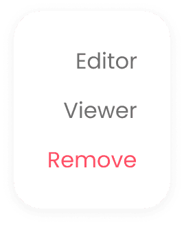
There must be some way to enhance the teams page…
team documents
Adding functionality with team documents.
To add some additional functionality to the teams page, I added a view of each team member's recent uploads, as well as an option to see all of their uploaded documents.
This increased the functionality of the team management page, allowing it to be used for document access in a broader range of situations, rather than only when permissions need to be changed.
clicked-on member → Condensed files
Quickly glance at relevant information
Doesn't take up too much vertical space
Inconsistent with style of uploaded documents
All members → Condensed files
Potentially overwhelming display
Takes up a lot of vertical space
Inconsistent with style of uploaded documents


clicked-on member → files with icons
Consistent with style of uploaded documents
Redundant information
Takes up a decent amount of vertical space
I decided to go with the first iteration, as it displayed the most relevant information while not being overwhelming to the user or taking up too much vertical space. Instead of focusing too much on having the exact same visual style everywhere, this iteration prioritizes user experience and ease of use.
An intuitive, functional team management page.
Users are able to invite members and manage their team, as well view each team members' uploaded documents at a glance.
REFLECTION
First time working on a team of designers.
This was my first time working collaboratively with other designers! I certainly learnt a lot and really enjoyed being able to not only bounce ideas back and forth, but also be fuelled by everyone's creative energy and passion for their craft. These are some of my key takeaways:
There is always space to innovate.
Despite the team management page being common and relatively similar between multiple products, I learned that there is always still space to think out of the box and carry on ideating and exploring new possibilities. There's no limit to innovation!
Working with clients is super exciting!
This is my first time designing for a client, and it was an amazing experience to be able to not only have an impact on a real-world product, but also to sit in on client meetings and give input to the team. I'm super excited to see where the LexMata product goes and how our designs materialize.
Learning is constant.
It was inspiring to see everyone on the team learning from one another. Despite us each having different levels of experience, we all had unique areas of expertise — making for some truly invaluable learning moments throughout the design process.
WHAT's NExt?
Seeing the impact of my designs.
Working on a real client product was extremely rewarding, and I'm looking forward to seeing my designs live on LexMata's platform. I would love to see these designs out in the world and improving the user experience of LexMata customers, and I can't wait to continue making tangible impact through future client work!