UX/UI
SHIPPED
CU Reviews — Cornell course review platform
Enhanced inituitiveness and efficiency of Cornell course metrics display for 3,000+ students. Now live on website!
Team
1 PM, 1 TPM, 1 PMM,
3 developers, 3 designers
RoLE
Product Manager & Product Designer
TIMELINE
Nov 2024 (1 month)
SKILLS/TOOLS
Interaction Design, Prototyping, Figma
CONTEXT
CU Reviews, created by the Cornell Digital Tech & Innovation project team, is a course review platform that allows students to share and browse reviews for courses offered at Cornell. With over 17,000 users since its launch in 2019, and currently serving 3,000+ active users, CU Reviews enhances the course enrollment process by providing students with the data to make well-informed decisions.
I worked on the CU Reviews team to redesign an outdated course metrics display that would integrate into a recently re-engineered course page layout.
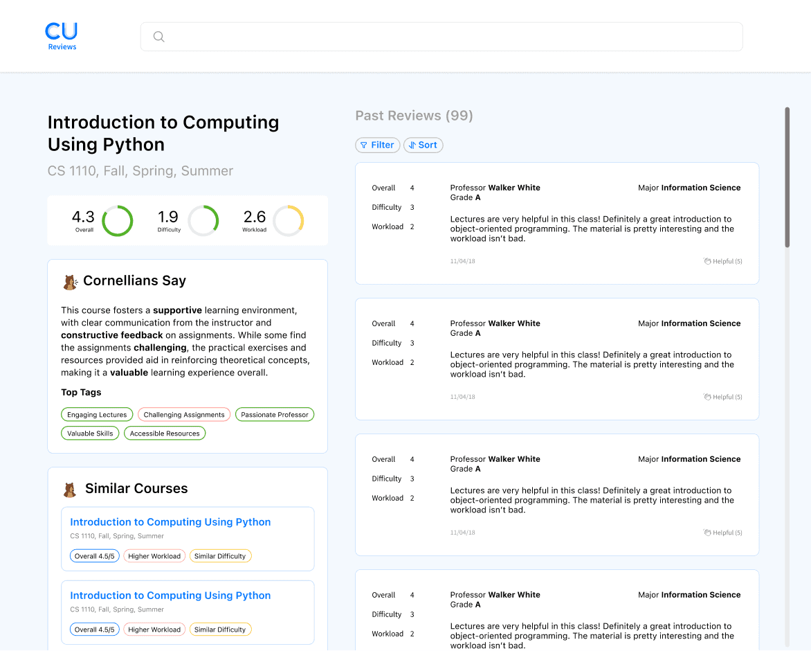
A sneak peek of the final design…
THE STORY OF CU REviews
Choosing courses is overwhelming, time-consuming, and inefficient.
With thousands of courses offered at Cornell that change both availability and instructor each semester, it is an extremely daunting task for students to make sense of all the options available to them.

"This class looked right up my alley — but it's actually nothing like what I'd thought it'd be!"
CU Reviews provides a much-needed solution by allowing students to:
Browse courses and their reviews
Evaluate key metrics
Share their own experiences with others
THE CURRENT SYSTEM
There is no easy way to find out relevant information about classes.
Relying on the official class roster, there is no way to see important information about a class, such as how easy it is, how heavy its workload is, or even just how enjoyable students find it.

BEFORE
Official class roster
Impossible to know what the class is actually like
Wordy
Lots of unnecessary information
AFTER
CU Reviews
Clear metrics and reviews
Summarized impressions and content tags
Student-written content
PRODUCT PROBLEM
CU Reviews' current course metrics are confusing and unintuitive.
While Overall is a positive metric (with a higher rating equating to positive sentiment), both Difficulty and Workload are negative metrics (with higher ratings equating to negative sentiment) — this makes it unintuitive to understand side by side, as there is a mismatch between the sentiments of the three gauges.
Taking over design work.
Previously, another had designer had been in charge of this redesign. However, due to external circumstances, I unexpectedly had to take charge of this task in addition to my work as the Product Manager of CU Reviews in order to ensure we kept up with product deadlines and sprint roadmapping. This means I had to pick up where the previous design work was left off.
UNDERSTANDING PREVIOUS ITERATIONS
Analyzing the existing design work.
The previous designer decided to switch to horizontal bars to match our existing design for submitting a review. Based on user research, she also separated Overall Rating from the other metrics to create a more readable display, and added clarifying descriptors to decrease confusion regarding sentiment.

COULD BE IMPROVED
Overall rating appears twice
Complex and difficult to parse
Lack of typographic hierarchy
WORKS GREAT!
Color-coded clarifying descriptors
Clear separation of overall rating
Dynamic, modern look
Increasing readability and intuitiveness.
With this analysis in mind, I decided to work on the redesign with a focus on ensuring that users would be able to quickly and intuitively understand course metrics at a glance.
SIMPLIFYING METRICS
Eliminating clutter.
Taking the original redesign, I removed the duplicate Overall Rating and designed a simplified version without all of the additional labels and with clearer typographic hierarchy to highlight the numerical scores. I also changed the font to SF Pro to match our design system.
This made it less cluttered, but upon consulting other designers on the team, we realized that the sentiments of difficulty and workload were still confusing.

How do we effectively communicate to users what the different ratings mean without creating too much clutter?
iconography and colors
Increasing intuitiveness.
ITERATION ONE

Intuitive iconography
Not cluttered
Unintuitive star color
ITERATION TWO

Intuitive iconography
Slightly cluttered
Unintuitive star color
ITERATION THREE

Intuitive star color
Not cluttered
No iconography
Final selection

Intuitive iconography
Intuitive star color
Not cluttered
To decrease confusion for users, I played around with adding colored smileys and color-coding the Overall Satisfaction stars to match the logic behind the Difficulty and Workload colors. I kept the standard colors of red, yellow, and green to represent sentiment being negative, neutral, and positive respectively, as this is intuitive and familiar to users, being widely used in society.
After talking to the CU Reviews team as well as conducting some user research, I found that adding a color-coded smiley next to the Difficulty and Workload measures was helpful — however, adding one next to the Overall rating felt cluttered, as it was already pretty self-explanatory.
"I still don't understand… What does 4.0 difficulty actually mean?"

HOVER STATES
Interaction design — subtle but important.
To clear up any potential confusion remaining, I aimed to add un-intrusive modals with concise explanations that would pop up when hovering, consistent with the rest of the website.
With the help of the other CU Reviews members, I decided on several descriptive phrases, sticking to simple verbiage to ensure accessibility.
Difficulty
Super easy
Doable
Challenging
WORKLOAD
Super light
Manageable
Lots of work
label positioning and phrasing
Positioning and phrasing.
Finally, I played around with the positioning and phrasing of the Overall Satisfaction label. I had realized that while not including this label made the metrics display extremely clean, it was not very clear what the rating on the left referred to. I knew I had to include some kind of label — so with this in mind, I explored different iterations of positioning and phrasing.

ABOVE + FULL WORDING
Clear wording
Imbalanced visual weight
BELOW + HALF WORDING
Balanced visual weight
Unclear wording


BELOW + FULL WORDING
Clear wording
Balanced visual weight
I decided to select the third iteration as the final modal design, as it not only had the clearest wording, but was also balanced well visually, as opposed to the first iteration, which felt unbalanced.
EDGE CASES
Some courses have no reviews.
I designed a separate display to account for classes without any reviews. Although it is easy to forget about designing for edge cases, remembering to do so greatly enhances user experience and maintains consistency.

An intuitive, easy-to-understand course metrics display.
Students can now easily grasp key metrics about courses at a glance, and if they are still confused, they are able to hover over the smiley icons to access a concise explanation.
REFLECTION
My first-ever design to go live.
As the Product Manager of CU Reviews, I'd never previously had the opportunity to contribute design-wise. It was extremely rewarding and fulfilling to finally be able to see a design of my own live, as this metrics redesign was implemented and pushed to the website a few weeks after I completed handoff!
Always prioritize the user.
At first, it didn't occur to me that the smiley icons might still not be descriptive enough. However, after conducting user testing, I realized that the feedback we collected revealed numerous insights I previously hadn't noticed due to my proximity to the work. It's crucial to listen to your users.
Not everything can be perfect all the time.
I was initially fixated on following processes to a T despite having a tight deadline. However, I soon learned that sometimes it is necessary to prioritize certain aspects of the design process over others for the sake of being able to deliver high-quality designs in time, even if doesn't feel ideal.
Responsive design is tricky!
It was my first time completing official handoff, and as the design was implemented, I realized that I had not accounted for different screen aspect ratios or set any breakpoints for resizing. The developers on our team helped me out, but I need to brush up on my responsive design skills!
WHAT's NExt?
CU Reviews Work
Now that my redesign is live, I hope to monitor our platform's Key Performance Indicators (KPIs) to see if the redesign has a positive impact on students using the site more or spending less time trying to understand a course's metrics.
After this, I would love to explore a redesign of other outdated sections of the CU Reviews website, such as the search results page and its included filters.
Overall, super happy and grateful to have been able to work with my amazing team on this!


